

Every design consultancy has award-winning projects, and a team that dreads writing the case studies that showcase them. That story, the one that could win new business, often gets stuck in scattered docs and slow approvals. For this project, I stepped in as Lead UX Designer for a 2-week sprint to fix this at the root by designing SuitCase, a Generative AI platform that turns case study creation into a guided, 3-click experience. The result: designers spend less time writing, approvers review with confidence, and business development gets a steady pipeline of polished stories to fuel pitches.
UX / UI Project
From Scramble to System: Designing SuitCase, a 3-Click GenAI Engine for Enterprise Portfolios
Timeline
2 Week Design Sprint
Role
UX Designer
Client
A Global Human-Experience & Design Consultancy
Project Overview
Turning a content bottleneck into a 3-click AI experience
The Situation
Great work, buried in a broken process
ABC’s design teams were shipping brilliant work faster than they could tell its story. Case study creation had become a fragmented scramble that drained designer hours delayed approvals and cost the business its most valuable marketing asset proof of great work.
The Challenge
Three very different people one system had to serve
Every case study passes through a designer who has to write it, a manager who has to approve it, and an admin who has to keep it organized and easy to find. Each of them needed something different, and designing for one risked failing the other two. With only two weeks on the clock, there was no time to get this wrong.
The Goal
Design one answer for three different problems
The goal was never just a feature, it was a single system that could give the designer speed, the manager confidence, and the admin control, without any one of them winning at the expense of the other two. If it worked, less time would go into writing about great work, and more time would go into creating the next piece of it.
Key Issues
One insight buried under a dozen symptoms
Designers, approvers, and admins each came with their own list of complaints, but not all of them carried equal weight. Visuals and collaboration were friction. Writing, structuring, and remembering project details was the real bottleneck, that was the one thing quietly costing the most time and the one insight every design decision had to answer to.
The Approach
Design starts with a question, not a screen
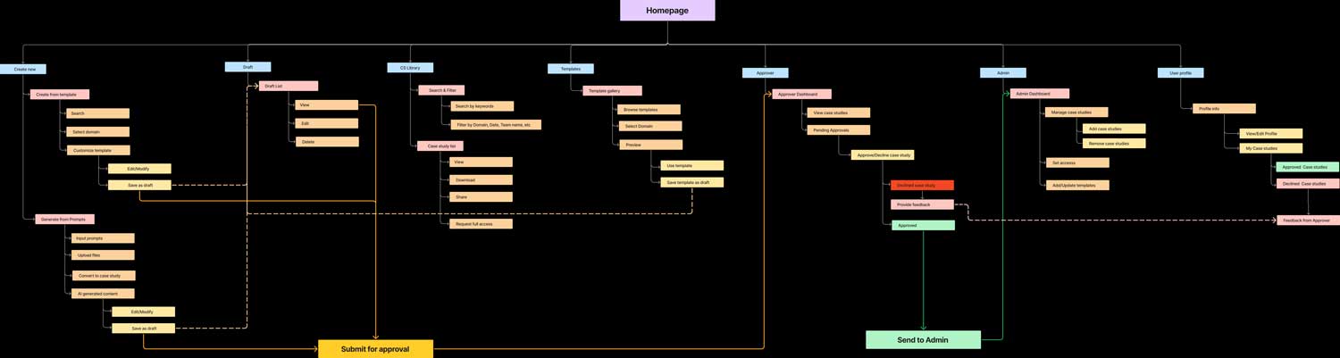
Two weeks isn’t enough room for wrong turns, so I front-loaded the thinking. So the first move wasn’t a wireframe, it was a map of the requirement, the questions worth asking, and the full workflow across all three roles. Everything that followed was just refining a structure that already made sense in the whiteboarding.
Research and Analysis
Turning conversations into a working structure
With the workflow mapped, I ran a structured set of questions across all three roles, covering everyday challenges, comfort with generative AI, and reactions to early platform ideas. Analyzing the responses side by side is what separated real blockers from small annoyances, and gave the design a clear order of priority to build against.
Parallel Design and Development
Three dashboards, one shared spine
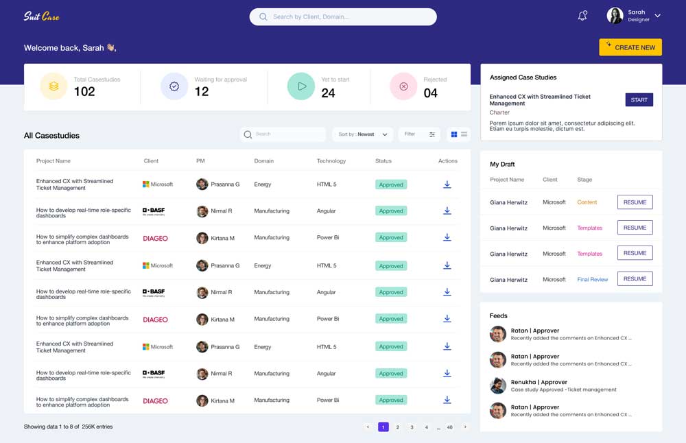
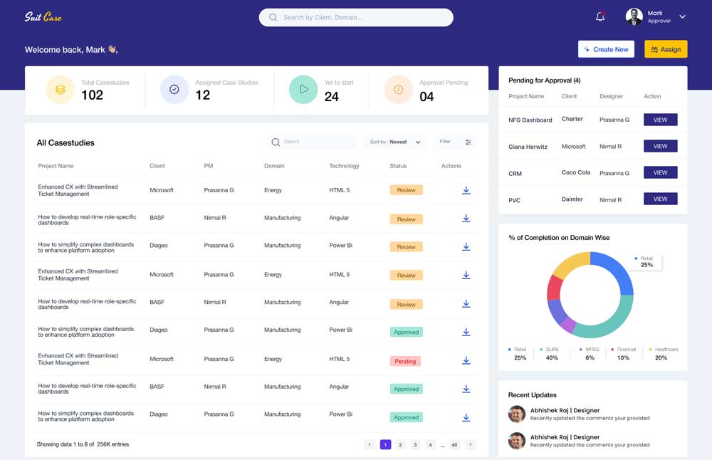
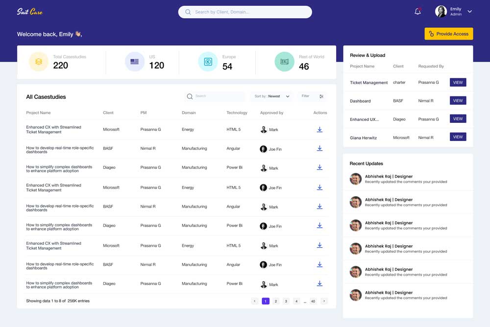
With priorities set, design moved forward alongside early scoping for build, rather than waiting for a full handoff. Instead of forcing everyone into one shared screen, I designed separate dashboards for creating, reviewing, and governing, each tailored to how that role actually works day to day, but all pulling from the same underlying data and workflow.
How We Convinced Our Clients
Letting their own words make the case
Instead of pitching the design as something new, I walked stakeholders through it using the exact problems they had described earlier, showing them the moment their own pain point turned into a screen. When people see their own complaint reflected back as a solved problem, the conversation stops being about convincing and starts being about next steps.
The Solution
From a blank page to a published case study, in three clicks
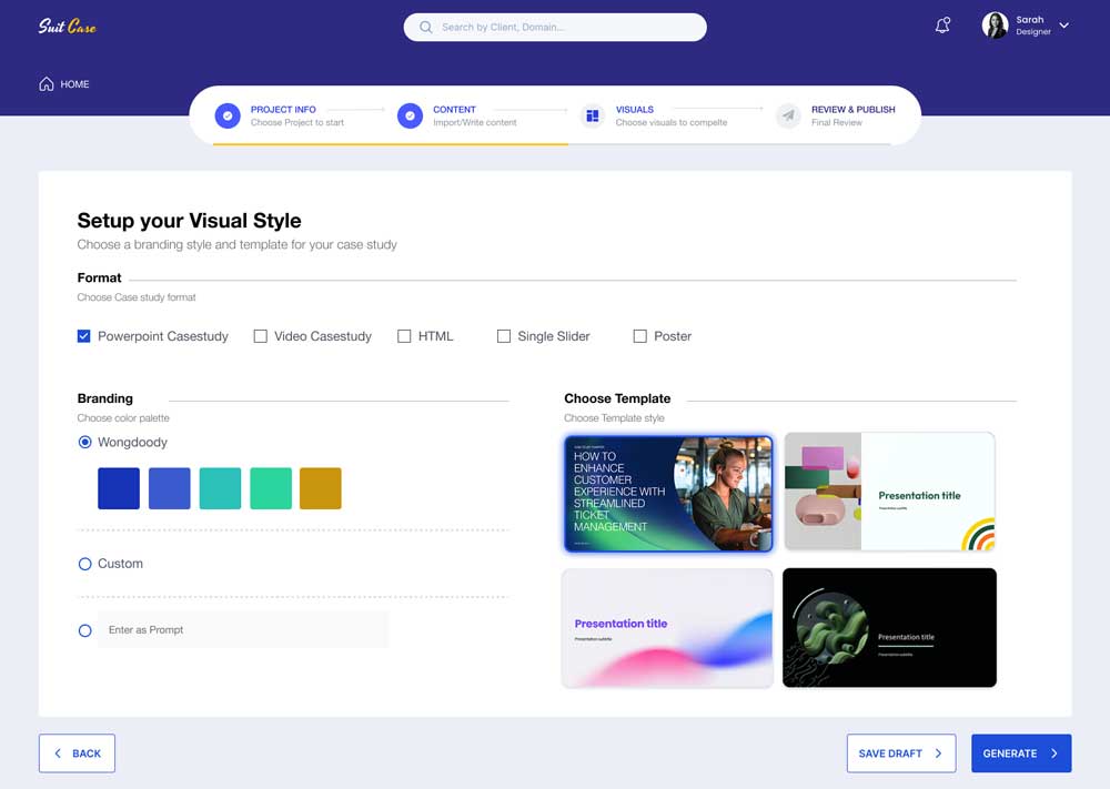
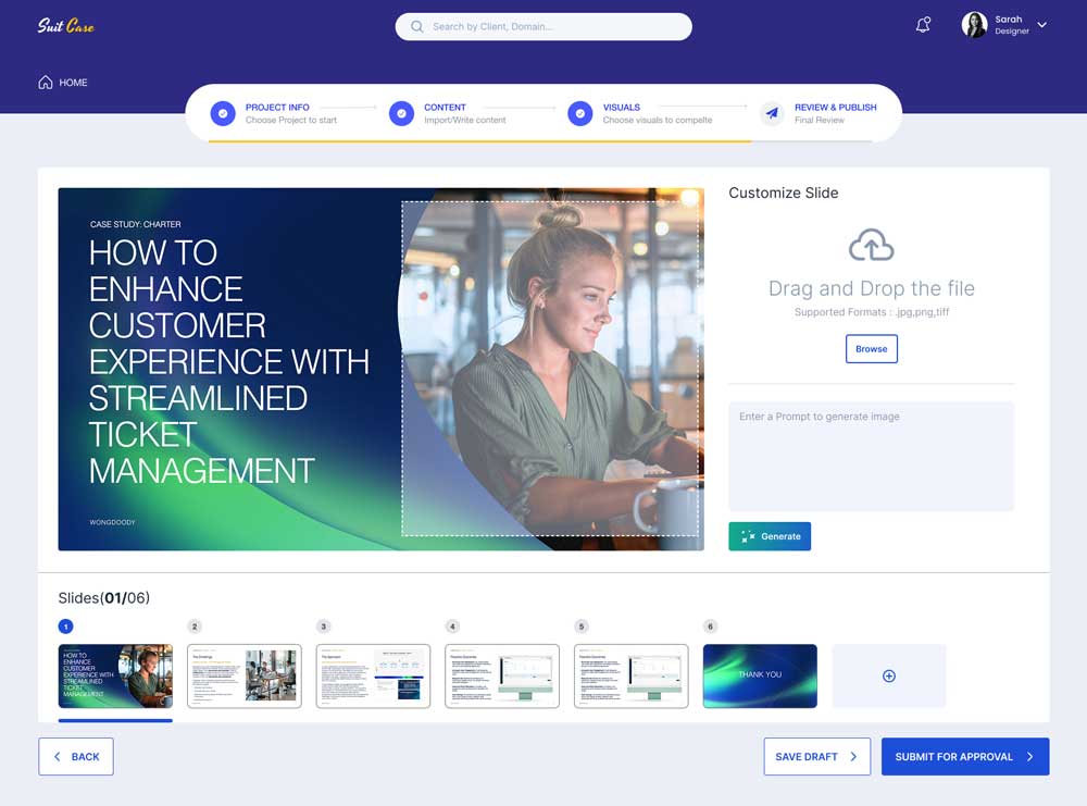
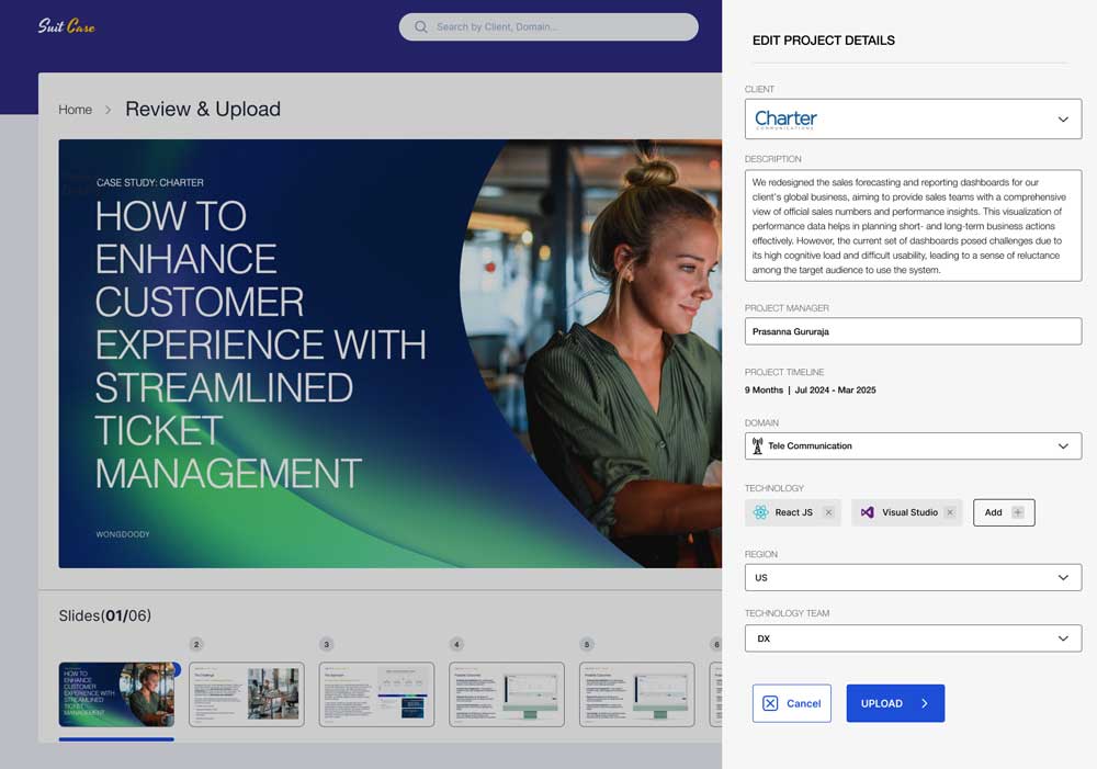
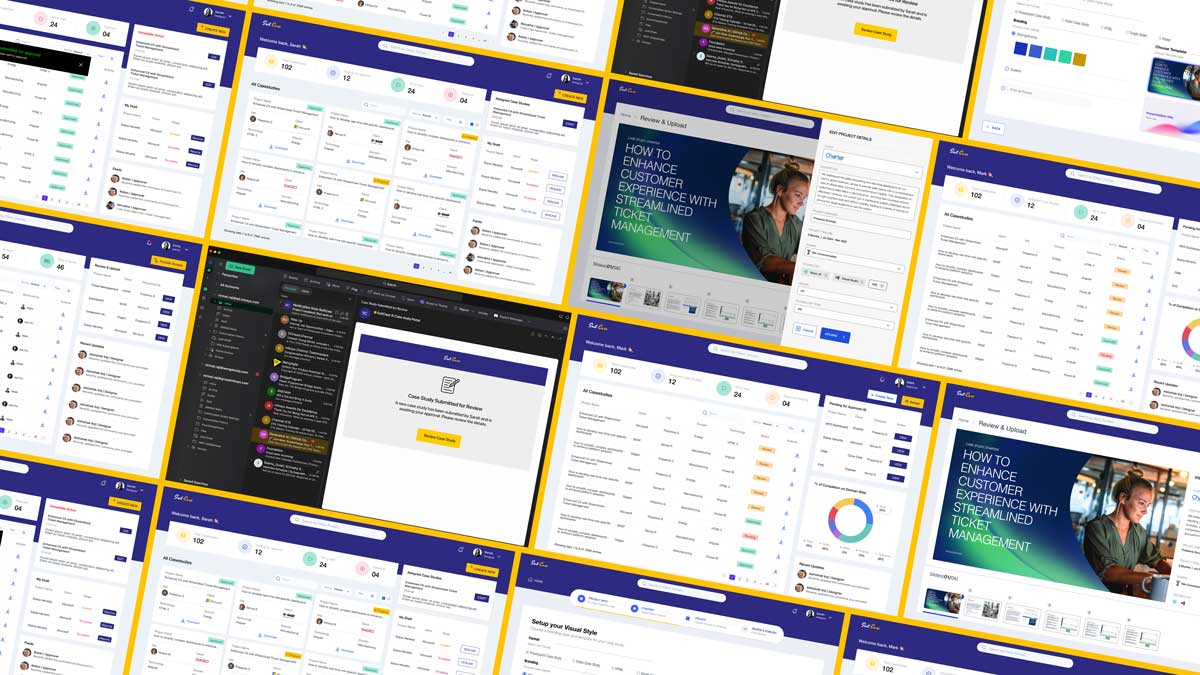
SuitCase turns that whiteboard thinking into a guided flow, where a designer’s prompt becomes a structured, brand-styled draft in minutes instead of days. Approvers work from a dashboard built for triage, and admins govern the whole repository from one view, so the same system that once took a team days to coordinate now runs itself.
The Impact Created
Three roles, one shared outcome: ROI
For designers, SuitCase meant less time writing and more time designing, for approvers, faster reviews without losing quality control, and for admins, a repository the business could finally search, trust, and scale. Together, that shift was designed to turn case studies from a hidden cost center into a reliable engine for new business, directly strengthening the ROI the whole project was built to protect.
Work
| UX / UI Project | 5 MIN READ |

| High Stakes UX / UI Project | 5 MIN READ |